Katja Kromann Portfolio
Web / Branding
Logo modification for BeamReaders, inc.
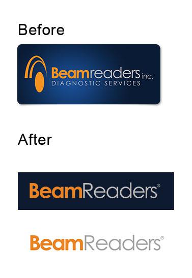
I recently suggested this change to the BeamReaders' logo to make a little less busy and also to make it take up less vertical space. At the same time, the client wanted to capitalize the 'R', as that is how they are usually typing their name in their marketing materials.
The logo can be printed on a dark background, or on a white background.
This article: Logo modification for BeamReaders, inc. first appeared on katjakromann.com