Katja Kromann Portfolio
Web / Branding
Responsive web design - mobile first
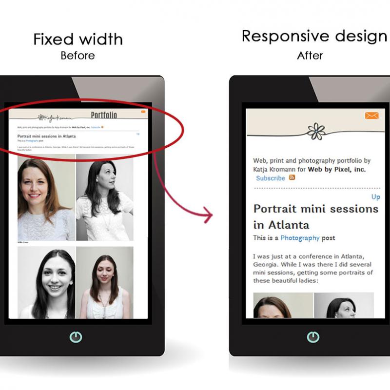
This website is now coming at you with responsive design. Responsive design is the relatively new way of designing websites so that they perform well across different platforms such as PCs, laptops, tablets and cell phones.
Since more and more traffic is coming from mobile devices such as tablets and cell phones, it makes sense that websites are now being designed with a 'mobile first' mind set.
Below you can see examples of how this websites now looks on a PC, a tablet and one a cell phone.

Below left you can see what the website used to look like with the old design when looking at it on a cell phone. While you could see more of the website on the screen, the text was really small and you had to pinch zoom on a cell phone to really read anything. With the new responsive design shown on the right, the text is now much more legible, making for a much smoother user experience.

Interested in a custom website with responsive design for cross platform useability? Contact me
Since more and more traffic is coming from mobile devices such as tablets and cell phones, it makes sense that websites are now being designed with a 'mobile first' mind set.
Below you can see examples of how this websites now looks on a PC, a tablet and one a cell phone.
Below left you can see what the website used to look like with the old design when looking at it on a cell phone. While you could see more of the website on the screen, the text was really small and you had to pinch zoom on a cell phone to really read anything. With the new responsive design shown on the right, the text is now much more legible, making for a much smoother user experience.
Interested in a custom website with responsive design for cross platform useability? Contact me
This article: Responsive web design - mobile first first appeared on katjakromann.com